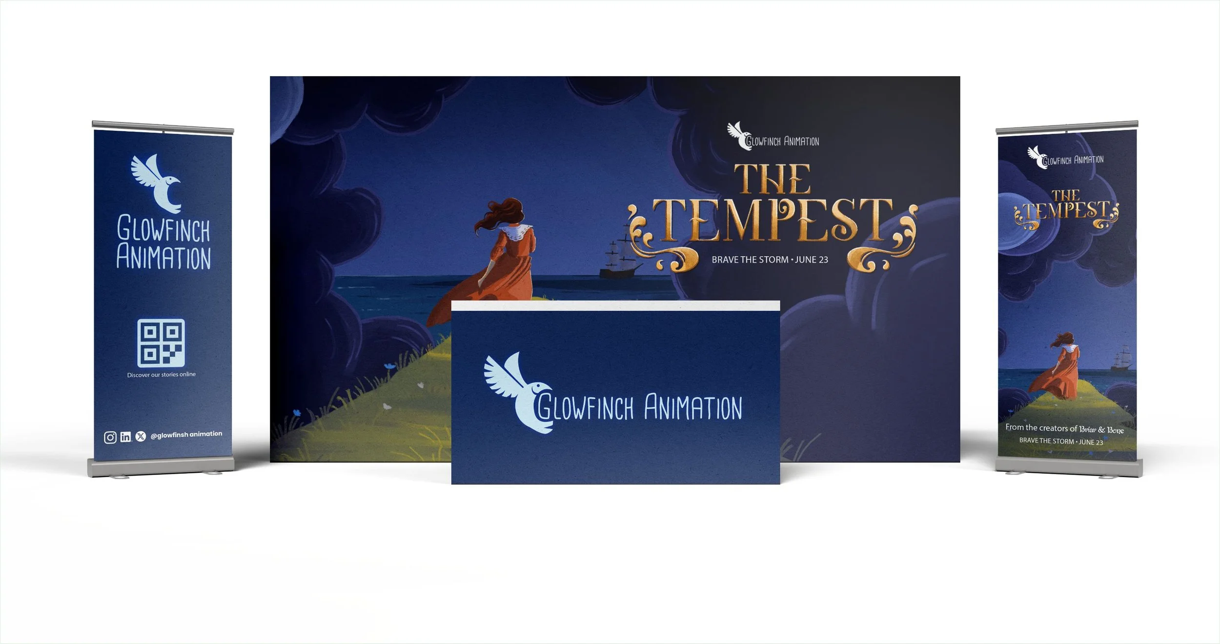
GlowFinch Animation is a fictional indie studio brought to life as part of a creative case study exploring how graphic design supports animated film production — before and beyond the screen. This project focuses on The Tempest, a fantasy-adventure feature reimagined from Shakespeare’s play, and includes key promotional materials like a hero poster, a pitch book, and branded event mockups.
From studio-facing branding to cinematic title design and festival-ready assets, the work blends storytelling with strategic communication — showcasing how graphic design can shape both a film’s world and the way it meets its audience.
Glowfinch Animation
Company
Personal ProjectRole
Graphic Designer & Illustrator
Project Type
Branding & LayoutYear
2025
A Brand in Motion
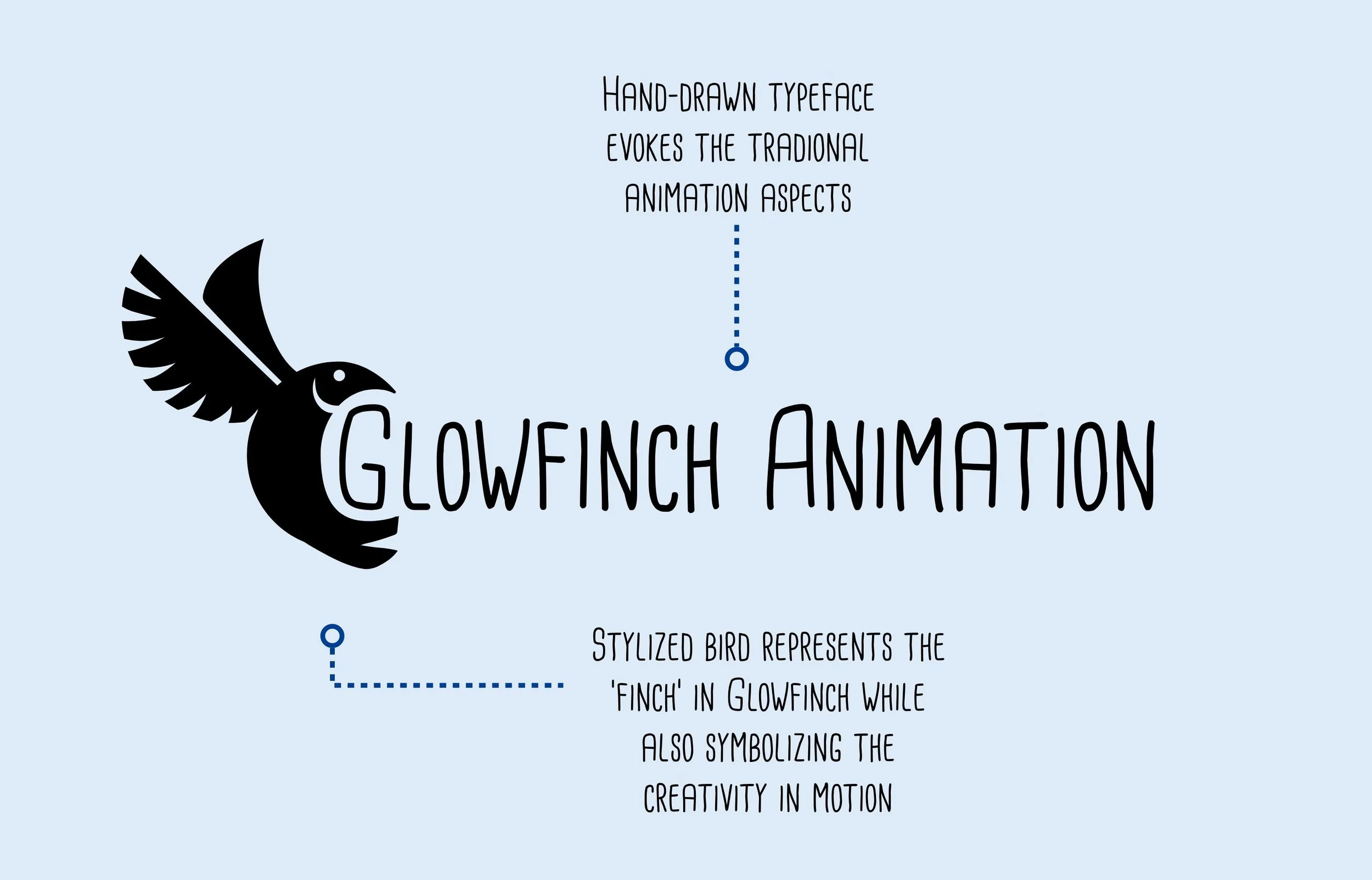
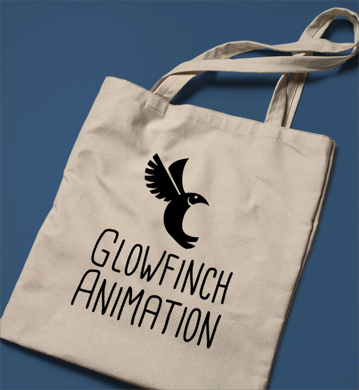
The GlowFinch Animation logo was designed to reflect the spirit of a small but ambitious indie studio: expressive, approachable, and full of movement. The stylized bird — mid-flight and gently curved — evokes creativity in motion, while the hand-drawn typeface brings a personal, handmade quality that feels warm and human.
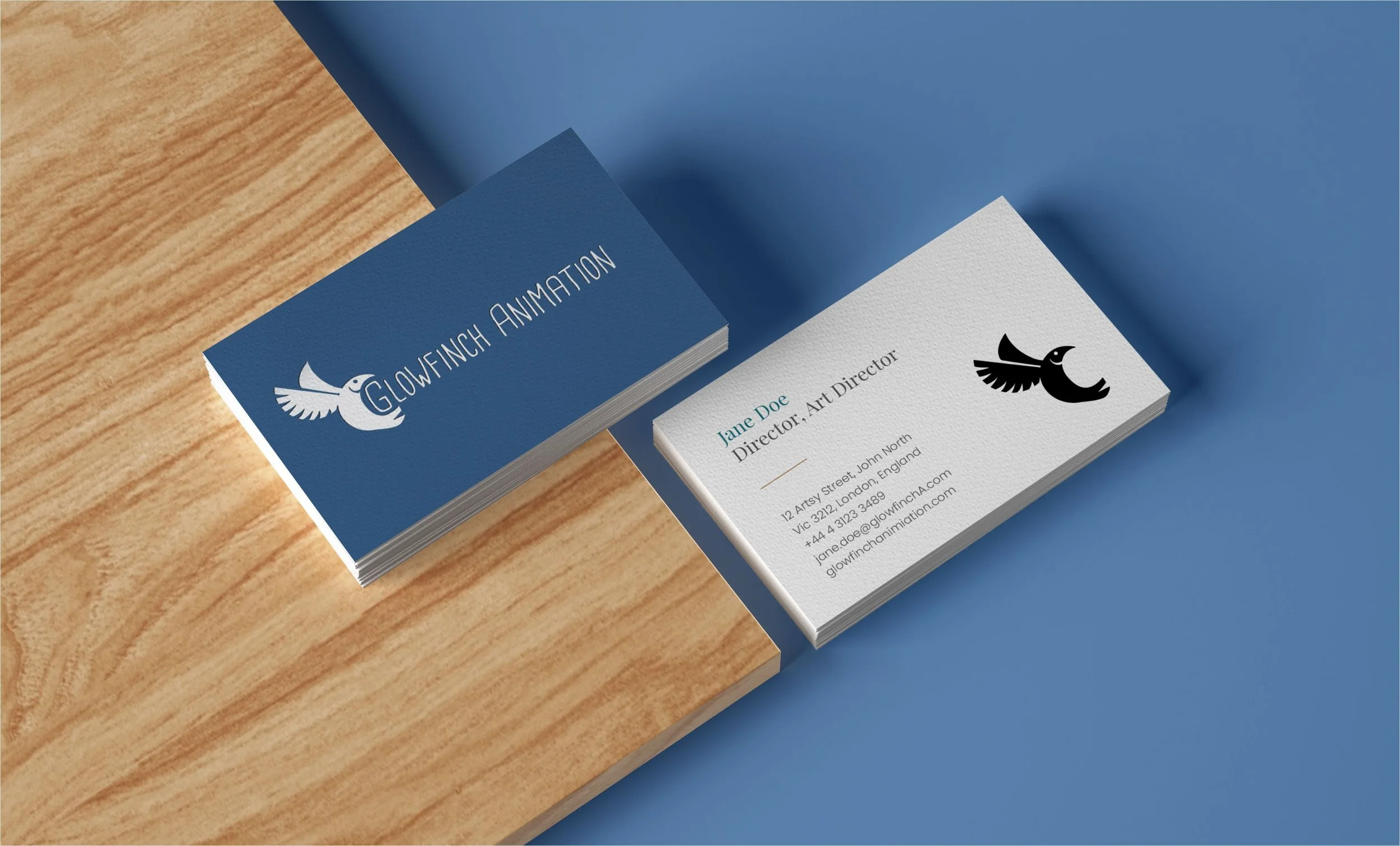
The result is an identity that balances playfulness with professionalism. It feels at home across both creative and strategic assets — whether it’s printed on a festival banner, featured on a pitch deck, or animated into a title card.
GlowFinch isn’t just a name; it’s a signal of the studio’s mission: to tell stories that are light-footed but emotionally grounded — and to bring a spark of magic into everything it touches.





Designing a Pitch Deck
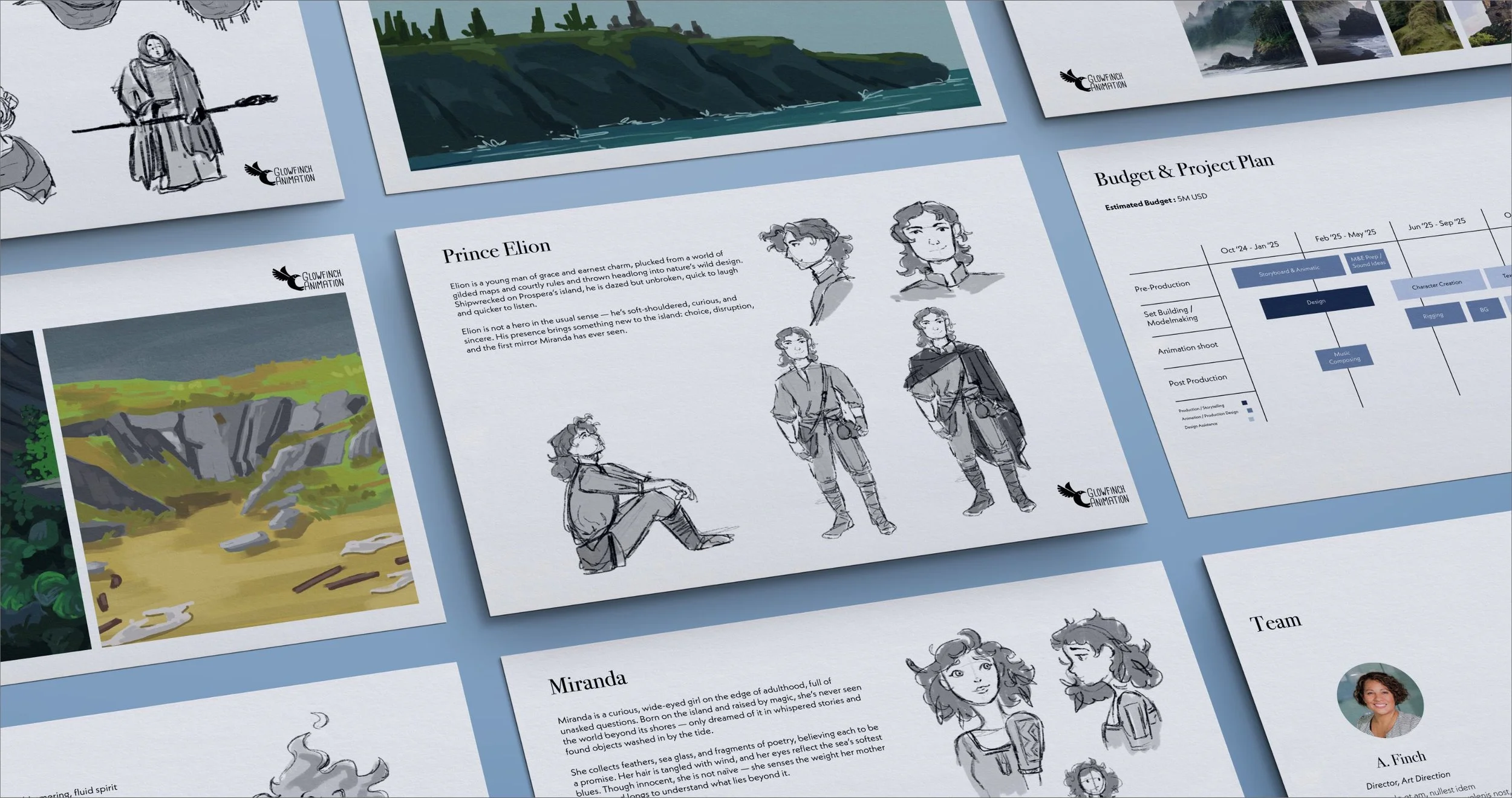
For The Tempest, I created a pitch deck layout that balances clarity, atmosphere, and cinematic energy. The goal was to craft a tool that could support both creative and strategic conversations — helping producers, partners, and festival juries quickly grasp the story, tone, and scope of the project.
The design relies on a modular structure and hand-drawn visuals that echo the film’s fantastical themes and stylized world. Each page guides the viewer through the narrative arc, visual direction, and production vision, while maintaining a consistent identity that aligns with GlowFinch’s branding. From character intros to the budget timeline, the layout supports storytelling through typography, pacing, and composition — transforming essential information into an engaging, memorable reading experience.

Poster Design & Title Exploration
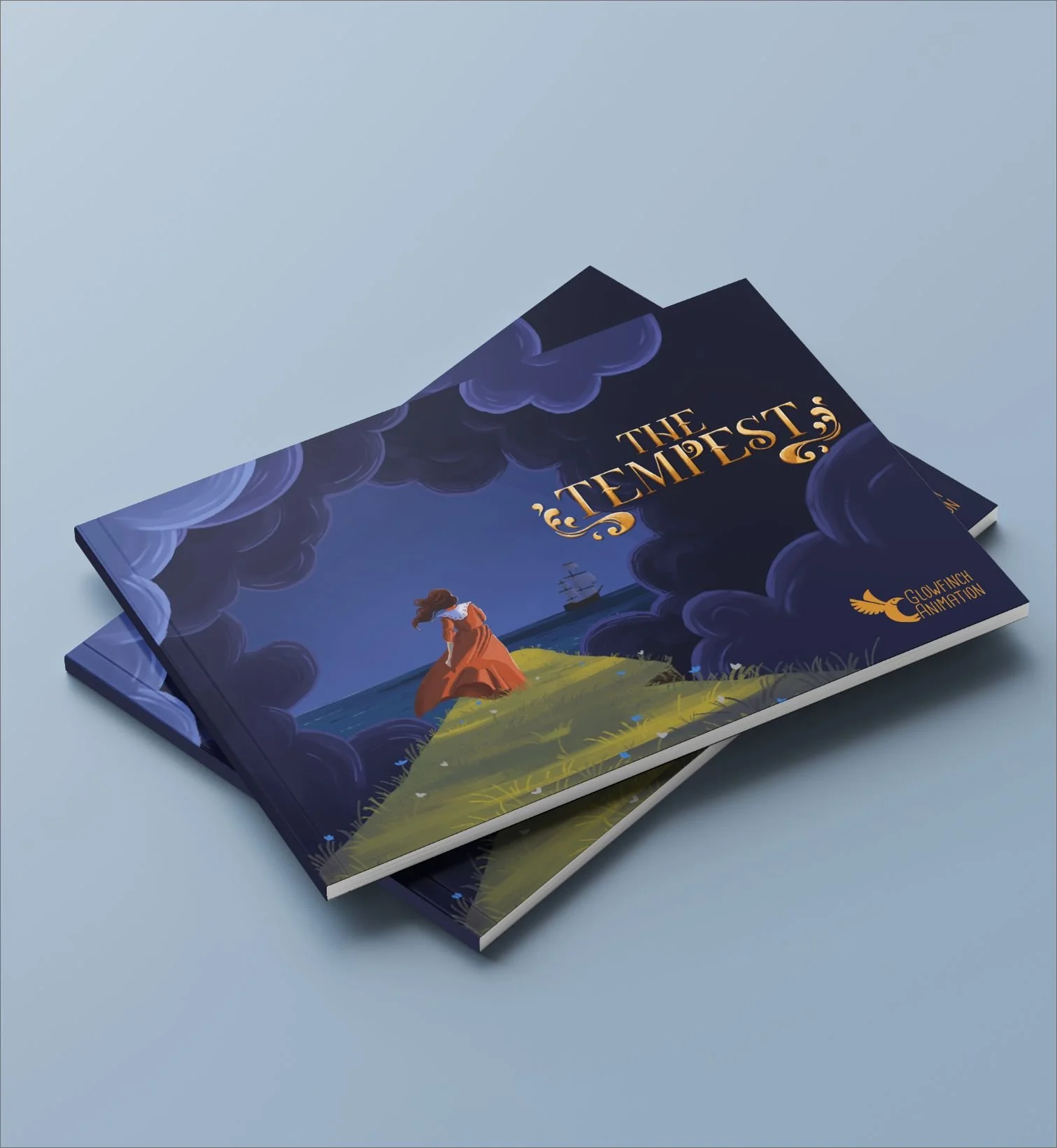
For The Tempest, I approached the poster designs as a space to explore both narrative tone and visual branding. A large part of the process was focused on creating a distinctive title treatment — one that could stand on its own as a graphic element while capturing the story’s mystical, ocean-bound atmosphere. This meant developing custom lettering that felt echoed the themes of magic, chaos, and transformation at the heart of the film while remaining lisable.
In parallel, I conducted multiple composition and color tests to experiment with mood, framing, and visual storytelling. Each version was an opportunity to test how much of the world to reveal, how to balance character and environment, and how light and palette could affect the emotional read. The final posters reflect a blend of classic adventure fantasy and modern animation aesthetics — designed to be iconic, evocative, and immediately tied to the film’s identity.


